


Angel of the Winds Casino Players Club Cards


Angel of the Winds Casino Resort Players Club Cards
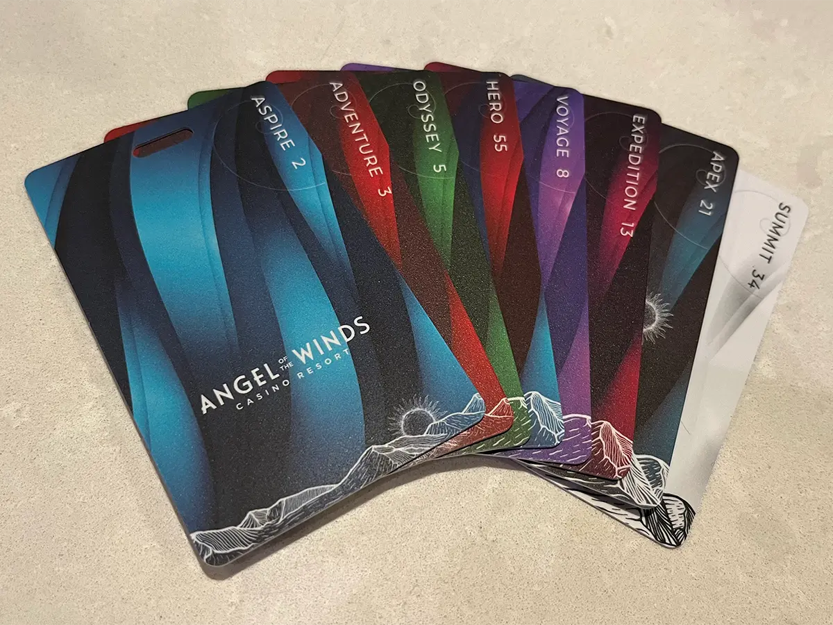
Leading the way in Angel of the Winds’ rebrand in late 2022, I led the complete redesign of the Players Club Cards. This saw the reintroduction of seven distinct player tier cards, plus a standalone tier for active duty, reserve, and retired military.
Looking to set these cards apart from the competition, we moved to a vertical orientation throughout. We also leveraged textural capabilities from our vendor to make these cards feel distinct from any other card in a guests’ wallet or purse.
Working closely with the Director of Marketing, we tried a number of different background visuals, landing on the layered ribbons as a dynamic and interesting graphic that provided the necessary color palette, without being overly distracting. Combined with a variety of different vector mountain ranges, clouds, sun, stars, moon, etc., each tier design brought it’s own personality, while retaining the overall brand aesthetic.
Various tier names with a variety of outdoor/adventure themes were suggested and reviewed–including cryptids, such as Sasquatch and Werewolf. After much deliberation and polling among various team members, focusing on the journey aspect provided both a clear hierarchy that aligned with the brand direction, and an enticing series of steps for a guest to travel up.
Further setting these cards apart, we opted to make the top tier card white. At the time every competitor with multiple tier card structures used a black card for their top tier–influenced in no small part by the status surrounding American Express’ Black Card. The choice to reverse the trend received significant positive feedback.
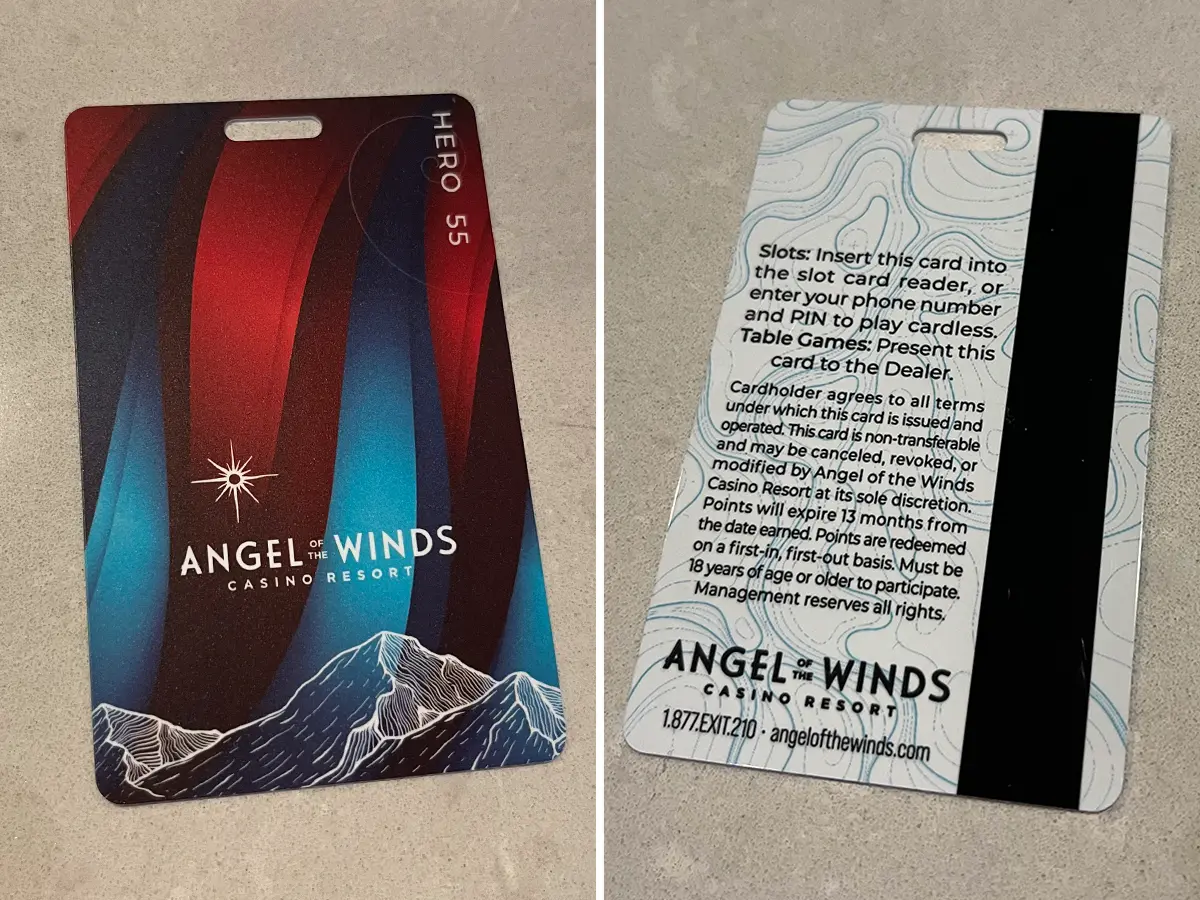
To improve the tier hierarchy, we also worked in Fibonacci number sequence, increasing from the entry level “Aspire” card up to the top tier “Summit” card. The “Hero” tier for military members received the next higher number in the sequence, a subtle display of respect and gratitude.
On the back side of the cards, further reinforcing the outdoor adventure brand direction, a faint topographic map-inspired pattern, set in the same color as the front of the card provided a subtle texture without impeding legibility of the copy. With the vertical layout carried through, all relevant copy was positioned with an appropriate space for the guest name and player number to be imprinted.
Additional Technical Challenges
Players Club Cards were received in bulk from the production vendor. These cards arrived ready to be encoded and imprinted. Previous designs of Players Club Cards had featured smooth faces on both sides, with guest name and player ID number being imprinted on the front of the card, and the magnetic stripe on the back being encoded at the same time.
The change to the textured card meant that the existing card imprinting and encoding hardware was no longer suitable. I coordinated with IT, Purchasing and Database teams to help identify and implement a solution. In the end, add-on modules from the card printer manufacturer added a duplexing capability, allowing imprinting and encoding on the same side of the card.
Made with Figma Sites Beta

Angel of the Winds Casino Players Club Cards

Angel of the Winds Casino Resort Players Club Cards
Leading the way in Angel of the Winds’ rebrand in late 2022, I led the complete redesign of the Players Club Cards. This saw the reintroduction of seven distinct player tier cards, plus a standalone tier for active duty, reserve, and retired military.
Looking to set these cards apart from the competition, we moved to a vertical orientation throughout. We also leveraged textural capabilities from our vendor to make these cards feel distinct from any other card in a guests’ wallet or purse.
Working closely with the Director of Marketing, we tried a number of different background visuals, landing on the layered ribbons as a dynamic and interesting graphic that provided the necessary color palette, without being overly distracting. Combined with a variety of different vector mountain ranges, clouds, sun, stars, moon, etc., each tier design brought it’s own personality, while retaining the overall brand aesthetic.
Various tier names with a variety of outdoor/adventure themes were suggested and reviewed–including cryptids, such as Sasquatch and Werewolf. After much deliberation and polling among various team members, focusing on the journey aspect provided both a clear hierarchy that aligned with the brand direction, and an enticing series of steps for a guest to travel up.
Further setting these cards apart, we opted to make the top tier card white. At the time every competitor with multiple tier card structures used a black card for their top tier–influenced in no small part by the status surrounding American Express’ Black Card. The choice to reverse the trend received significant positive feedback.
To improve the tier hierarchy, we also worked in Fibonacci number sequence, increasing from the entry level “Aspire” card up to the top tier “Summit” card. The “Hero” tier for military members received the next higher number in the sequence, a subtle display of respect and gratitude.
On the back side of the cards, further reinforcing the outdoor adventure brand direction, a faint topographic map-inspired pattern, set in the same color as the front of the card provided a subtle texture without impeding legibility of the copy. With the vertical layout carried through, all relevant copy was positioned with an appropriate space for the guest name and player number to be imprinted.
Additional Technical Challenges
Players Club Cards were received in bulk from the production vendor. These cards arrived ready to be encoded and imprinted. Previous designs of Players Club Cards had featured smooth faces on both sides, with guest name and player ID number being imprinted on the front of the card, and the magnetic stripe on the back being encoded at the same time.
The change to the textured card meant that the existing card imprinting and encoding hardware was no longer suitable. I coordinated with IT, Purchasing and Database teams to help identify and implement a solution. In the end, add-on modules from the card printer manufacturer added a duplexing capability, allowing imprinting and encoding on the same side of the card.
Made with Figma Sites Beta
Angel of the Winds Casino Players Club Cards
Angel of the Winds Casino Resort Players Club Cards
Leading the way in Angel of the Winds’ rebrand in late 2022, I led the complete redesign of the Players Club Cards. This saw the reintroduction of seven distinct player tier cards, plus a standalone tier for active duty, reserve, and retired military.
Looking to set these cards apart from the competition, we moved to a vertical orientation throughout. We also leveraged textural capabilities from our vendor to make these cards feel distinct from any other card in a guests’ wallet or purse.
Working closely with the Director of Marketing, we tried a number of different background visuals, landing on the layered ribbons as a dynamic and interesting graphic that provided the necessary color palette, without being overly distracting. Combined with a variety of different vector mountain ranges, clouds, sun, stars, moon, etc., each tier design brought it’s own personality, while retaining the overall brand aesthetic.
Various tier names with a variety of outdoor/adventure themes were suggested and reviewed–including cryptids, such as Sasquatch and Werewolf. After much deliberation and polling among various team members, focusing on the journey aspect provided both a clear hierarchy that aligned with the brand direction, and an enticing series of steps for a guest to travel up.
Further setting these cards apart, we opted to make the top tier card white. At the time every competitor with multiple tier card structures used a black card for their top tier–influenced in no small part by the status surrounding American Express’ Black Card. The choice to reverse the trend received significant positive feedback.
To improve the tier hierarchy, we also worked in Fibonacci number sequence, increasing from the entry level “Aspire” card up to the top tier “Summit” card. The “Hero” tier for military members received the next higher number in the sequence, a subtle display of respect and gratitude.
On the back side of the cards, further reinforcing the outdoor adventure brand direction, a faint topographic map-inspired pattern, set in the same color as the front of the card provided a subtle texture without impeding legibility of the copy. With the vertical layout carried through, all relevant copy was positioned with an appropriate space for the guest name and player number to be imprinted.
Additional Technical Challenges
Players Club Cards were received in bulk from the production vendor. These cards arrived ready to be encoded and imprinted. Previous designs of Players Club Cards had featured smooth faces on both sides, with guest name and player ID number being imprinted on the front of the card, and the magnetic stripe on the back being encoded at the same time.
The change to the textured card meant that the existing card imprinting and encoding hardware was no longer suitable. I coordinated with IT, Purchasing and Database teams to help identify and implement a solution. In the end, add-on modules from the card printer manufacturer added a duplexing capability, allowing imprinting and encoding on the same side of the card.
Made with Figma Sites Beta