


Case Study: Skagit Symphony Program


Overview
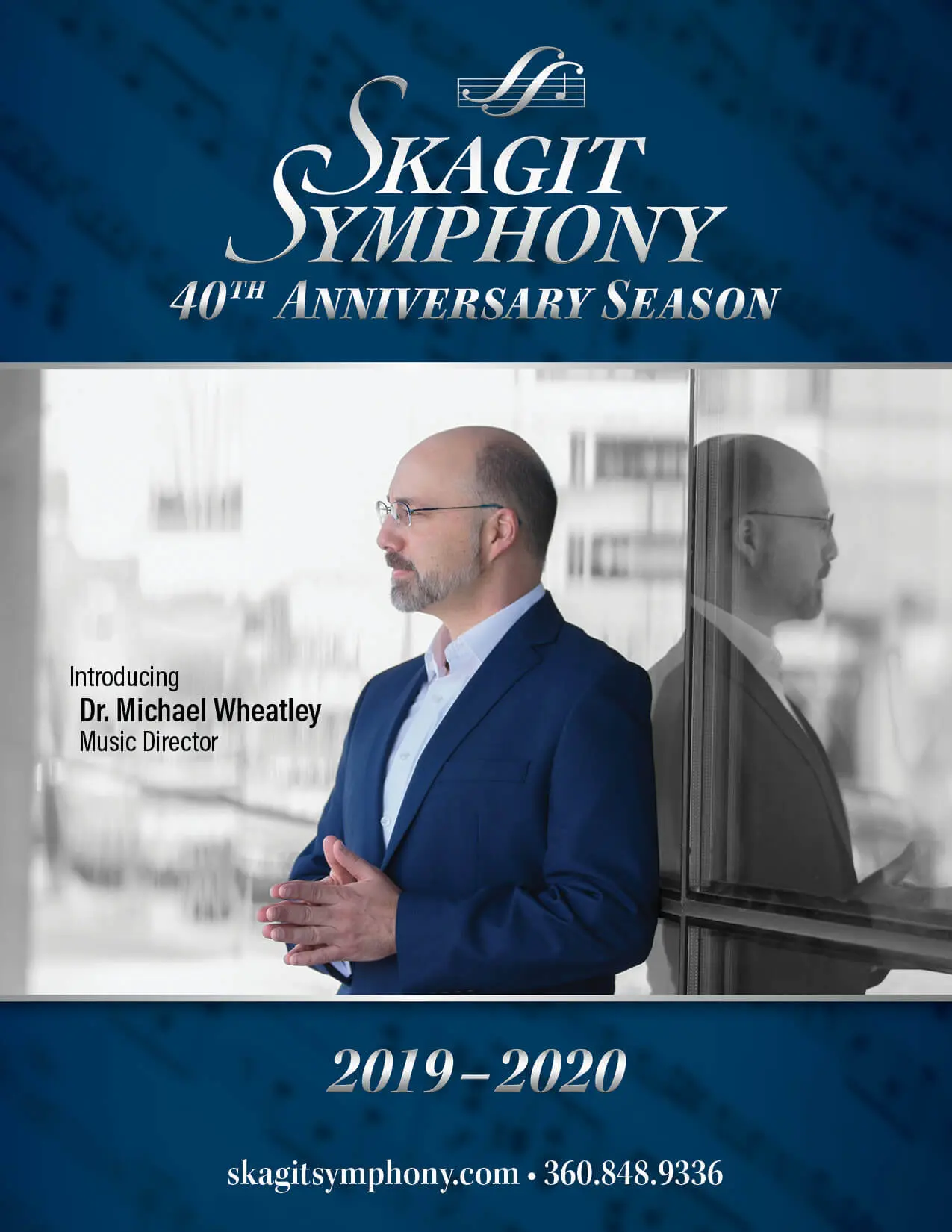
The 2019-2020 season for Skagit Symphony saw the introduction of their new Conductor and Music Director, Michael Wheatley. Through connections with members of the Symphony management, I sought–and was granted an opportunity to take a fresh look at how the Symphony handled their concert programs, leveraging the change of Music Director to do so.
Objectives and Challenges
This was the first time the entire season’s content had been collected into a single year-long program. Intended to be kept and reused by concertgoers, with three key objectives in mind:
- Convey all relevant information for the present concert
- Generate excitement and anticipation for the next concert
- Highlight the local businesses that support this community orchestra.
Key challenges to address in this project were:
- Balancing the improved readability of larger point sizes throughout with a need to keep the page count in check.
- Sourcing content for the entire season in little more time than what would be typical for a single concert.
- Ensuring buy-in and approval from all stakeholders occurred within the necessary timeframe.
Process and Considerations
Prior to the program, I had designed a season schedule teaser rack card. This piece provided a starting point for the program cover and established typographic conventions that are still utilized today.

Pairing the serif Kepler with the sans-serif Acumin allowed for clear delineation of sections throughout, while the broad variety of weights and widths for both families permitted sub-level hierarchy. As many symphony patrons are older, and may have a difficult time with small text, readability was aided by trending slightly larger in the overall point sizes throughout, however, strategically using semi-condensed widths, helped keep the overall page count–and by extension, the cost in check.
Consistent communication and collaboration with the Symphony Operations Manager was crucial to ensuring I had all relevant content to place in the program, and that any proofs for review were transmitted to the appropriate stakeholder(s).
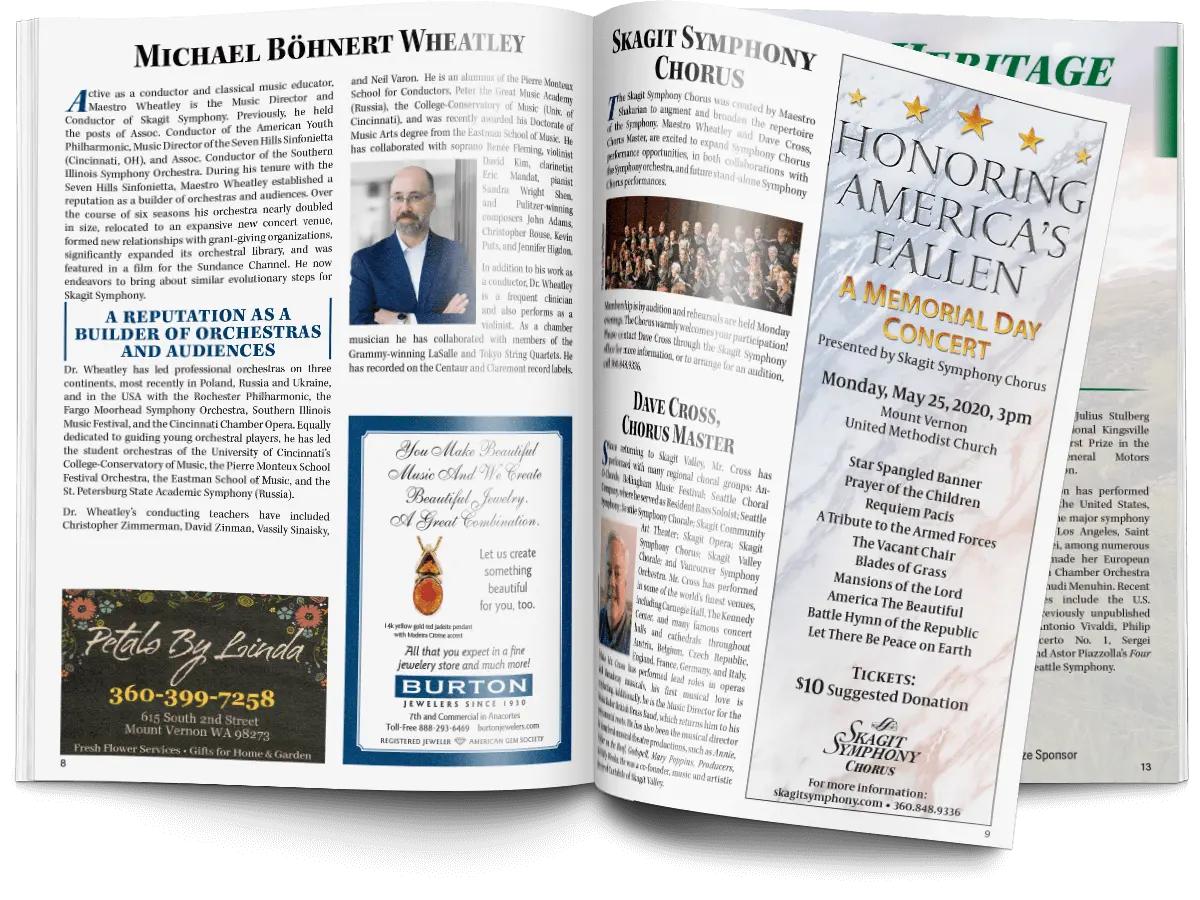
Each concert in the season featured its own musical–and visual theme. I designed each of these visual themes for the season, leveraging a highlight color from each to provide a visual chapter guide. Bleeding these concert-specific colors in blocks off the page edge greatly simplified the task of finding the desired concert information.
Additional Tasks
In addition to the overall layout and design of the program, I also designed the standalone collateral for each concert within this season–apart from the January Family Concert.
I also handled all press-readiness checks and edits–including resolution and color space needs for all submitted advertiser content and handed the collected project files off for production. While the printer utilized for this has a local office, the actual piece was offset printed and saddle stitched in another facility out of state, with mailed color proofs for our approval.
Conclusion
The tight collaboration with the Symphony team throughout the entire process, allowed for a shared sense of pride and ownership in the resulting program. When addressing the audience ahead of the first show of the season, the Executive Director went as far as to highlight the new program and mention me directly–all to an enthusiastic round of applause.
From the outset, the program seemed to achieve the desired goals, however, this season was cut short due to the pandemic in March 2020. Subsequent programs once public performances resumed reverted back to single-show pieces.
Made with Figma Sites Beta

Case Study: Skagit Symphony Program
Overview
The 2019-2020 season for Skagit Symphony saw the introduction of their new Conductor and Music Director, Michael Wheatley. Through connections with members of the Symphony management, I sought–and was granted an opportunity to take a fresh look at how the Symphony handled their concert programs, leveraging the change of Music Director to do so.
Objectives and Challenges
This was the first time the entire season’s content had been collected into a single year-long program. Intended to be kept and reused by concertgoers, with three key objectives in mind:
- Convey all relevant information for the present concert
- Generate excitement and anticipation for the next concert
- Highlight the local businesses that support this community orchestra.
Key challenges to address in this project were:
- Balancing the improved readability of larger point sizes throughout with a need to keep the page count in check.
- Sourcing content for the entire season in little more time than what would be typical for a single concert.
- Ensuring buy-in and approval from all stakeholders occurred within the necessary timeframe.
Process and Considerations
Prior to the program, I had designed a season schedule teaser rack card. This piece provided a starting point for the program cover and established typographic conventions that are still utilized today.
Pairing the serif Kepler with the sans-serif Acumin allowed for clear delineation of sections throughout, while the broad variety of weights and widths for both families permitted sub-level hierarchy. As many symphony patrons are older, and may have a difficult time with small text, readability was aided by trending slightly larger in the overall point sizes throughout, however, strategically using semi-condensed widths, helped keep the overall page count–and by extension, the cost in check.
Consistent communication and collaboration with the Symphony Operations Manager was crucial to ensuring I had all relevant content to place in the program, and that any proofs for review were transmitted to the appropriate stakeholder(s).
Each concert in the season featured its own musical–and visual theme. I designed each of these visual themes for the season, leveraging a highlight color from each to provide a visual chapter guide. Bleeding these concert-specific colors in blocks off the page edge greatly simplified the task of finding the desired concert information.
Additional Tasks
In addition to the overall layout and design of the program, I also designed the standalone collateral for each concert within this season–apart from the January Family Concert.
I also handled all press-readiness checks and edits–including resolution and color space needs for all submitted advertiser content and handed the collected project files off for production. While the printer utilized for this has a local office, the actual piece was offset printed and saddle stitched in another facility out of state, with mailed color proofs for our approval.
Conclusion
The tight collaboration with the Symphony team throughout the entire process, allowed for a shared sense of pride and ownership in the resulting program. When addressing the audience ahead of the first show of the season, the Executive Director went as far as to highlight the new program and mention me directly–all to an enthusiastic round of applause.
From the outset, the program seemed to achieve the desired goals, however, this season was cut short due to the pandemic in March 2020. Subsequent programs once public performances resumed reverted back to single-show pieces.
Made with Figma Sites Beta